/* this is mystyle.css */

/* Comments in CSS are formatted differently to HTML comments */


/* Carousel CSS */
.carousel-inner img {
  width: 100%;
  height: 100%;
}
background-color: lightblue;

/* Jumbotron CSS, change the background image link here */
.jumbotron{
  text-align: center;
  margin-bottom:0;
  background-image: url("webbackground.png");
  /* recommended jumbotron background image size is 2560 x 1440 pixels */
  background-size: cover;
}

 <div class="carousel-inner">
      <div class="carousel-item active">
        <img src="Class_Cheddar__1_-removebg-preview.png" alt="Cheese1" width="1100" height="500">
      </div>
      <div class="carousel-item">
        <img src="Class_Cheddar__2_-removebg-preview.png" alt="Cheese2" width="1100" height="500">
      </div>
      <div class="carousel-item">
        <img src="Class_Cheddar__3_-removebg-preview.png" alt="Cheese3" width="1100" height="500">
      </div>
      <div class="carousel-item">
        <img src="Class_Cheddar__4_-removebg-preview.png" alt="Cheese3" width="1100" height="500">
      </div>
    </div>


    <!DOCTYPE html>
<html lang="en">


<head>
  
  <title>CoolCheese</title>

  <!-- these help the browser, we'll leave them in -->

  <meta charset="utf-8">
  <meta name="viewport" content="width=device-width, initial-scale=1">

  <!--these are remotely hosted scripts, we'll keep them the same -->

  <link rel="stylesheet" href="https://maxcdn.bootstrapcdn.com/bootstrap/4.5.2/css/bootstrap.min.css">
  <script src="https://ajax.googleapis.com/ajax/libs/jquery/3.5.1/jquery.min.js"></script>
  <script src="https://cdnjs.cloudflare.com/ajax/libs/popper.js/1.16.0/umd/popper.min.js"></script>
  <script src="https://maxcdn.bootstrapcdn.com/bootstrap/4.5.2/js/bootstrap.min.js"></script>

  <!-- this is a link to our external css stylesheet, edit it as you wish -->
  <link rel="stylesheet" type="text/css" href="mystyle.css">
</head>

<!-- this is where the body (the content) of our page starts -->

<body>

  <!-- this is the top of the page -->
  <!-- modify your own background graphic link in the CSS file -->

  <div class="jumbotron">
    <img src="Cool_Cheese-removebg-preview.png" alt="logo">
  </div>

  <!--this is the navigation bar at the top of the page -->

  <!--each of these nav class codes gives a different colour combination -->
  <!--use the one that best suits your design, keep the others commented out -->

  <!-- <nav class="navbar navbar-expand-sm bg-dark navbar-dark"> -->
  <nav class="navbar navbar-expand-sm bg-info navbar-dark">


    <a class="navbar-brand" href="#">Navigation</a>
    <button class="navbar-toggler" type="button" data-toggle="collapse" data-target="#collapsibleNavbar">
      <span class="navbar-toggler-icon"></span>
    </button>
    <div class="collapse navbar-collapse" id="collapsibleNavbar">
      <ul class="navbar-nav">
        <li class="nav-item">
          <a class="nav-link" href="index.html">Home</a>
        </li>
        <li class="nav-item">
          <a class="nav-link" href="gallery.html">Gallery</a>
        </li>
        <li class="nav-item">
          <a class="nav-link" href="showreel.html">Showreel</a>
        </li>
        <li class="nav-item">
          <a class="nav-link" href="skillset.html">Skillset</a>
        </li>
        <li class="nav-item">
          <a class="nav-link" href="contact.html">Contact</a>
        </li>
      </ul>
    </div>
  </nav>

  <!-- ### this <div> tag begins the main content for this page ### -->
  <div class="container" style="margin-top:30px">

    <div class="row">

      <div class="col-sm-4">
        <h2>About Me</h2>
        <p>
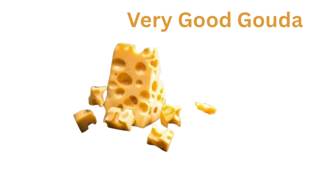
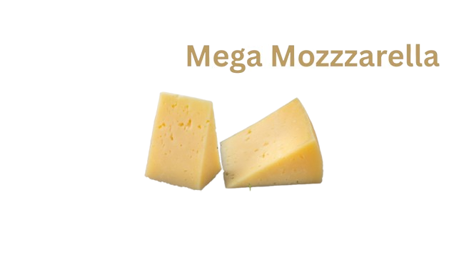
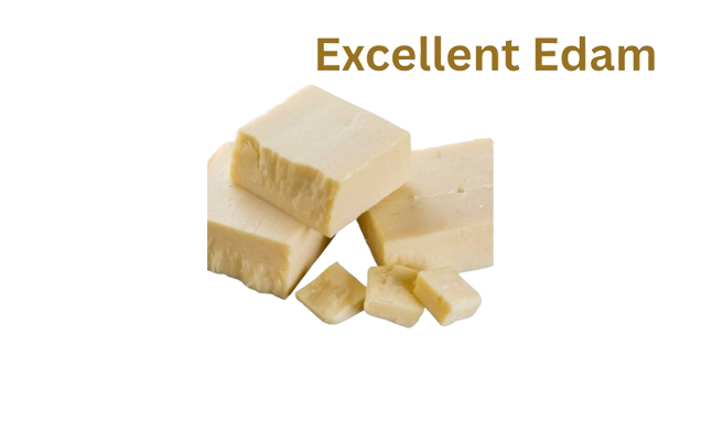
Hello my name is Jack Berrill and welcome to the website for my new cheese company, CoolCheese</p>

        <!-- section with some links, useful for external portfolio links, for example to Adobe Portfolio -->
        <!-- See here for how to change the link colours: https://tinyurl.com/2Z7ahtce -->

        <
        <ul class="nav flex-column">
          <li class="nav-item">
            <a class="nav-link" href="https://www.google.com">Link</a>
          </li>
          <li class="nav-item">
            <a class="nav-link" href="https://www.adobe.com">Link</a>
          </li>
          <li class="nav-item">
            <a class="nav-link" href="https://www.w3schools.com">Link</a>
          </li>
        </ul>
      </div>

      <!-- use this section to highlight 2 college projects of your choice, make sure both images are the same dimensions -->


      </div>
    </div>

    <!-- ### This </div> tag closes the main content ### -->
  </div>

  <!-- this is the footer, it's the same on every page. It's a good place to put a contact email -->
  <div class="jumbotron text-center" style="margin-bottom:0">
    <p>CoolCheese</p>
  </div>

</body>
</html>

